How To Maximise Your Freelance Writer's LinkedIn Profile About and Experience Sections

In my previous post "How To Set Up Your LinkedIn Profile As A Writer", I went through the most important things you need to get right in the Introduction section of your profile.
In this post I'm going to explain:
- the next two sections to focus on that will make your profile as a writer stand out and why
Which Sections To Focus On First (As A Freelance Writer)
You may be aware that the Introduction (some people call it the Title) section is not the only part of your profile that can be searched. The Experience and About sections are searchable as well.
This means that you can use all of these section to your advantage so that people who need your services can find you.
Let's have a look at each of them.
The About Section
It may come as a surprise that the About section is actually not about you at all. It's about who you've helped and how they have benefited from working with you.
Long-time professional copywriter, Steven Lewis says it best ...
"The last person you should be talking about on your website is you. Your About Us page is not about you at all, even though you've called it that. It's about your ideal client. The About (Them) page is about their problems, as seen through the lens of your qualifications."

Not only does writing about how you helped your client make people pay attention, it also highlights how well you can write.
So here are three things you definitely should do in your About section
- Say who you've helped and how. Keep it succinct. You're not writing a book here. But do include details about the problem you helped your client solve and how they feel now. Think of it as a 4-paragraph mini-case study that looks something like this:
- What was the problem your client faced?
- What was the impact of that problem on their business?
- What did you do to help them? E.g. wrote a fantastic whitepaper that helps sales, came up with great website copy that converts, wrote blog posts that keep people on a page for longer
- What was the impact on your client or their business from the work you did for them?
- Include links to your published work. This is a great way to showcase your work, talk about your zone of genius (the type of writing that you're great at) and also point out the specific types of writing you typically do for your clients.
- Include links to guest posts, especially if you're still building your writing portfolio. And you're feeling like the number of links you can provide to your published work is a bit skimpy. Guest posts are an excellent way to demonstrate the quality of your writing (and research skills).
- Include links to articles and posts you've written on LinkedIn. Not only will that help drive traffic to those articles and posts, but they will make it obvious that you have something to say and that you can say it well ... in writing.
Bonus Tip:
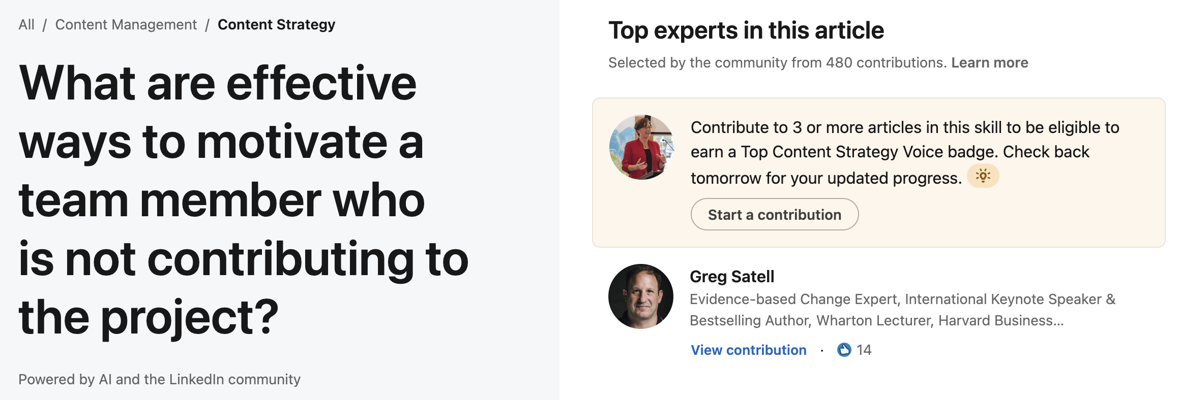
A bonus to a solid About section is that LinkedIn is always on the lookout for people who post well-written articles on the platform (and help spread the word that they exist). You may even be approached by one of LinkedIn's team members and asked to contribute to articles they create, where they seek the opinions of experts (like you) on various topics (see my example below ⬇️).

If you ever get a request like the one above, click on it and you'll see something that looks like the image below ⬇️. Follow through and you'll earn yourself a badge which sits prominently on your profile and adds credibility.

The Experience Section
The Experience section used to be where all online CVs and resumes went to sit there and do nothing. Lots of people (including writers) would wonder why they should even bother. It's not like they were hunting for a J.O.B.
But it's not like that any more. Even people who ARE looking for a job treat this section differently (or they should if they want to be noticed).
So as a writer, DO NOT treat the Experience section as a place where you dump stuffy, boring verbiage about yourself. Don't treat it like a resume.
Instead, use engaging words to describe what you've written for your clients or work that you've done for previous organisations when you were an employee and what difference it made for them.
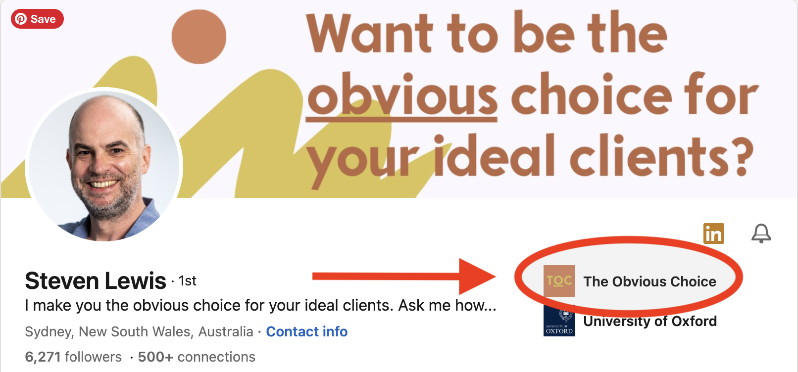
And you can get a little bit clever here. Because the latest place you worked as an employee shows up underneath your banner in the Introduction section. Not so many people realise that. So use that little tiny snippet to highlight the name of your business (and be sure you have your logo uploaded so that shows as well).

And there you have it. The About and Experience sections are two of the sections that you'll want to pay special attention to. They are searchable, which means that if someone is hunting for a writer with your skills, they will be able to find you much more easily.
Focus on making your About and Experience sections stand out and you have a much greater chance that people will reach out to you and ask for your help.
How amazing would it be to have people come to you, instead of you always having to pitch for work!
So now it's action time.
Taking Action
- Write up your About section and focus on how you've helped your clients. Include at least one mini-case study.
- Update your Experience section and use the same focus ... how your clients have benefited from working with you. Maybe even include a second and third mini case study. Or highlight your process for working with clients. Check that your business logo shows up.
- Do a quick review of your Introduction section and tweak it if necessary
Coming Up
The next posts in this series will cover some of the other sections that you can use to highlight your prowess as a freelance writer and some tips for how to make them stand out.
Check them out here:
Resources
Canva (affiliate link) is a brilliant tool for creating your LinkedIn Introduction section banner, as well as header images for your articles and posts. Canva makes it super easy to experiment with different styles, fonts and layout. Their free account has all the functionality you need and it's user-friendly.


Member discussion